Microsoft’s Windows Phone 7 won’t be introduced until Fall, but test units are out and about, and reviews are starting to surface.
Among some well-known blogs, below is a list of some discerning remarks on Microsoft’s re-entry into the smartphone world:
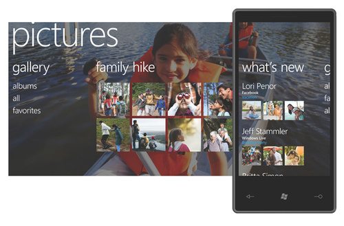
- UI is a change from iPhone and Android, with a style all its own
- The touch screen is very responsive, and the virtual keyboard is as good as Apple and better than Android.
- It’s missing cut, copy, and paste, and it won’t support background multitasking for third party apps.
- There is no threaded email, and there is no unified inbox.
- The browser is very good. It has tabs which all load even if they’re in the background.
- The phone doesn’t support Flash or Silverlight, and it doesn’t support HTML5, either. You can’t watch YouTube.
- The Zune pass, which gives you almost unlimited access to music is great, but it’s about $15 a month.
- The camera comes with options to configure white balance and image effects as you’re taking pictures.
- Microsoft has less than par Mobile Microsoft Office. Word and Excel have some editing features, but neither are particularly impressive.
- The maps application is nice, but limited.
- Because it’s just starting out, there’s almost no third party apps. Microsoft will have some at launch, but it will be way behind Apple and Google.
Bottom line, Windows Phone 7 has a decent start, but has a long way to go, and doesn’t offer anything super compelling to switch from iPhone or Android.
Published on July 27, 2010


