Renowned American social media and tech giant Facebook, Inc. has just very recently announced the official release of its Facebook Desktop redesign, which, not only is already live for all users, but also comes with a really nice feature that has been requested for years and years, and that is none other than a new Dark Mode.
The social media giant had already announced this upcoming change at its last year’s Facebook F8 2019 conference (which Facebook holds at an annual basis).

However, Facebook’s website revamp doesn’t only bring its users the long-waited Dark Mode.
Let’s have a look at all the new features that come with the brand-new Facebook Desktop redesign.
THE NEW Facebook Desktop redesign
Reduce Glare with Dark Mode
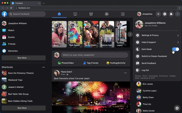
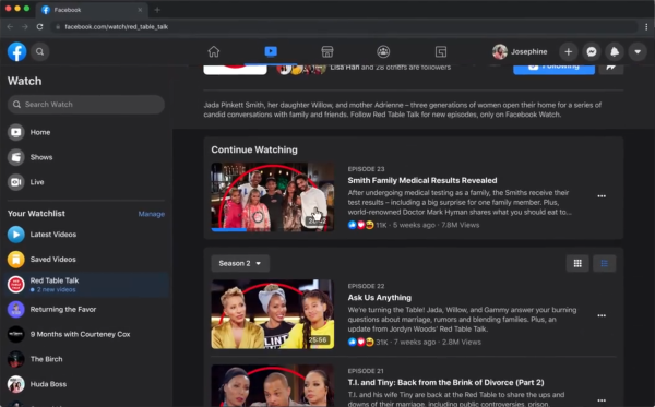
Starting off with the long-waited feature, the brand-new Desktop version of the website finally brings Dark Mode to desktop users, which not only minimizes screen glare in low-light environments, but also improves the experience in viewing videos on Watch.
“The new immersive layout along with Dark Mode makes viewing videos on Watch a great experience.”
The website revamp had already been rolled out for some test-users earlier this year.
As shown in Facebook’s sample video, activating Dark Mode for this new Desktop version of the website is as simple as toggling the option on the upper-right side of the screen.

The release of Dark Mode to Facebook’s Desktop version came right after the feature’s official roll out on Facebook Messenger (Mobile Version) back in April.
At the same time, the company’s owned WhatsApp (purchased back in February 2014 for $19.3billion) also introduced the Dark Mode feature in March, which, according to the messaging service’s software team, was the most requested feature among WhatsApp users.
Find Things Faster
Other than the long-awaited Dark Mode, Facebook’s brand-new Desktop redesign also brings users a new streamlined navigation, thus improving the page-to-page navigation on the desktop version of its website.
This new “quality-of-life” improvement makes it easier for users to search just about any content, which, according to the company, has “never been easier to find videos, games and Groups”.

Furthermore, thanks to this new updated Desktop version, both the website’s home page and page transitions also load faster now, something that the company reported to be “similar” to the “mobile experience”.
Manage Pages, Groups and Events with Ease
Lastly, as this recently released Desktop version is also simpler and easier to use, the new website revamp also makes it easier for users to create Events, Pages, Groups, and ads on Facebook’s interface.

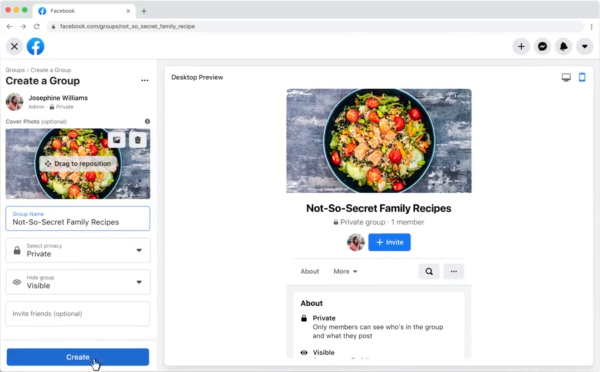
Users will now be able to preview a new Group in real time while creating it (and before actually confirming its creation).
Not only that, but they’ll also get to see what that same Group they’re still creating will look like on Facebook’s mobile App.
Facebook’s Plans for the Future
Facebook itself confirmed that with most of its focus directed to the mobile experience, its desktop website “had fallen behind.”
In order to address this issue, the social media giant decided to spend the last few months doing research on what should be included in a long-overdue update.
Lastly, Facebook also stated that it will “keep improving the experience” after the official launch of its new Facebook Desktop version.
The company has invited all users to share their thoughts on the new update, and that can be done by going into the Setting Menu (at the top right of the page’s interface) and clicking on the “Give Feedback” button.


