Earlier this year (back in January 31st, 2022), Google had announced that it was planning on updating the look of its Gmail’s interface, more specifically within Gmail’s main control panel (i.e. its main menu page), which the company will do by integrating Google Chat, Google Meet, and Google Spaces to Gmail’s side-bar, along with some additional elements from Google’s Material Design 3.

It seems like the time for that U.I. (User Interface) change – which Google simply calls “The Integrated View” – has finally come, as according to the American multinational tech Giant, that said refresh to Gmail’s interface is now becoming available for all Gmail users worldwide.
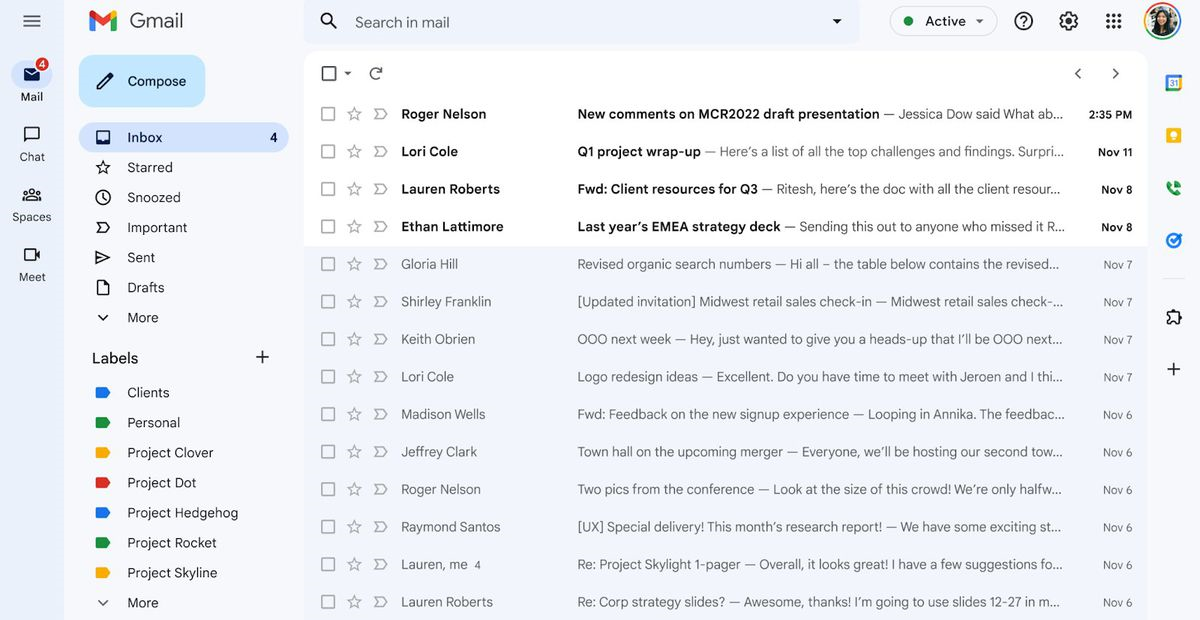
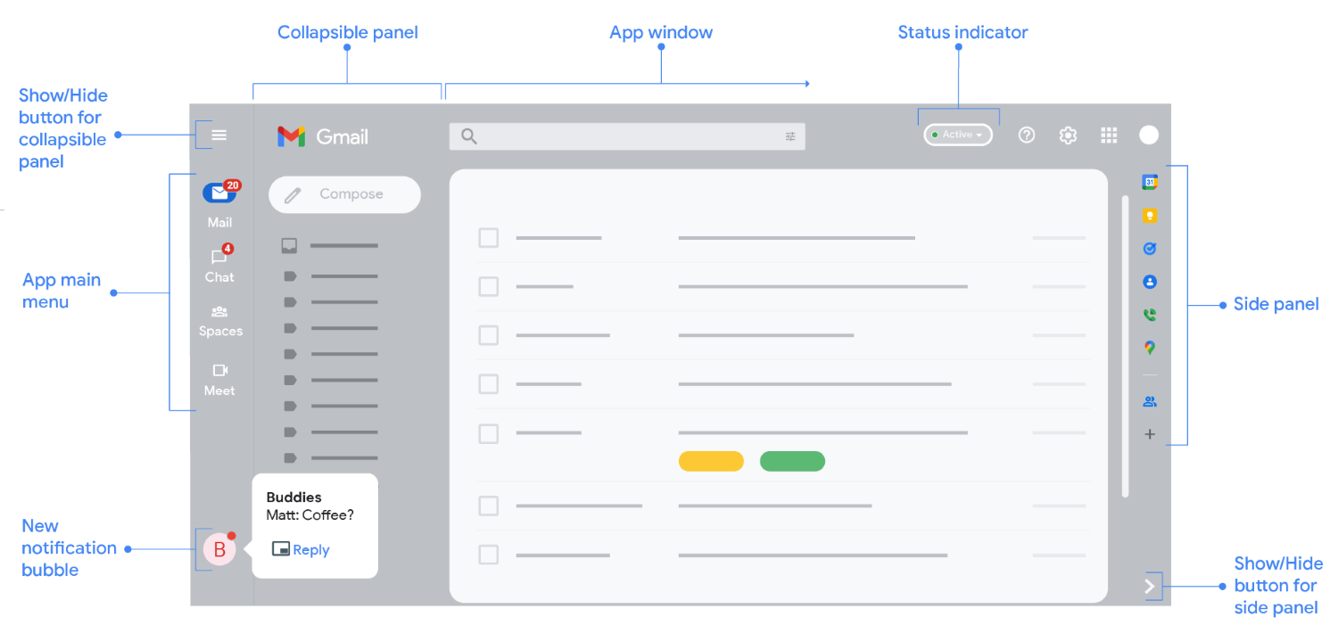
Essentially, this revamp to Gmail’s interface makes it so that Google’s other messaging tools (i.e. Google Chat, Meet, and Spaces) – which are part of (but not necessarily limited to) Google’s very own Google Workspace business-focused suite – will no longer be these smaller windows that you’d have floating alongside your emails. Instead, they’ll now all get their own dedicated control panels within Gmail’s interface, for which each of those can be easily accessed via large buttons integrated directly onto Gmail’s left-side toolbar.

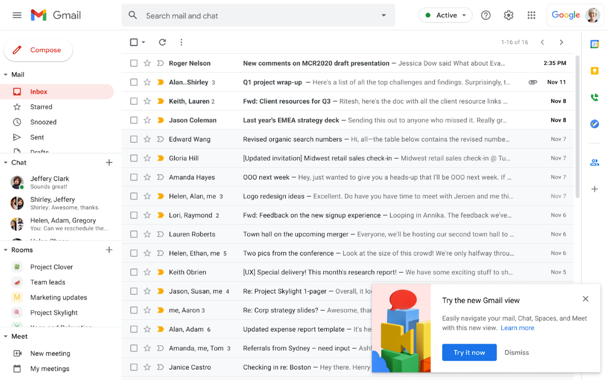
To be a little more specific, note that Google interface’s updated UI specifically moves the Google Mail, Chat, Meet, and Spaces buttons all together into one simplified list that’s located directly at the top of the left rail (in alternative to showing several conversations with other users from each of those work-tools in a cluttery list of a longer format).
These modernizing U.I. changes are a part of Google’s overall new approach to their revamped Workspace suite (which also includes other work-tools like Google Docs, Sheets, etc.), and are ultimately supposed to provide a more unified style to all Gmail users, along with new AI-powered features like Google’s recently announced improvements to Gmail’s search-functions.

While this cleaner-looking revamp makes Google’s interface “feel” somewhat different from what most users were used to, the Google Mail, Chat, Meet, and Spaces tools are all still easily accessible, with the best part being that a user is no longer required to have everything opened on their screen all at once.
This ultimately allows users to quickly jump into a conversation within any of those tools, as a more simplified list for each specific tool will immediately pop out the moment you hover your mouse-cursor over its corresponding icon.
Nevertheless, it’s still important to note that while this new look has just recently become the new standard / default look for Gmail’s user interface (which you can still change back to the old look, mind you), the company has stated that this new interface look will ultimately become the only available option by the end of Q2 2022.
Keep in mind that if you mainly use Gmail for work-related purposes, then this Gmail interface update may have already been rolled out to your account.
On a side note, specifically for people who really don’t like this change to Gmail’s interface, as said before, know that for now, you still have the option to switch back to the old look, but, once again, remember that later in the year, that new interface look will become permanent for all Gmail users worldwide.
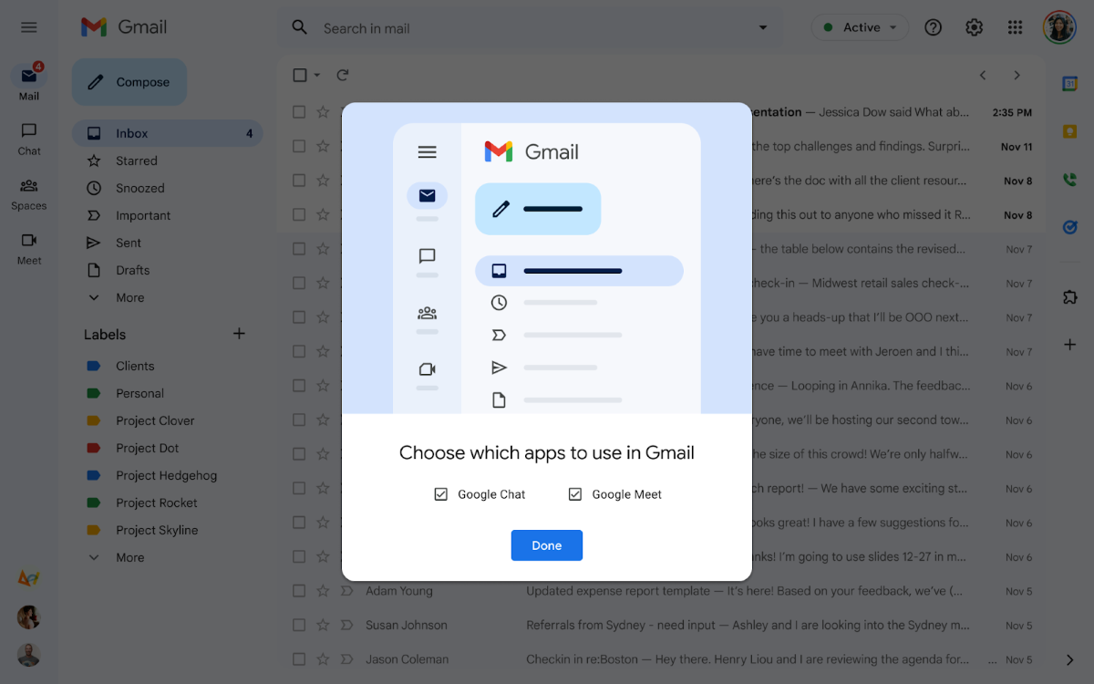
Moreover, note that even if you happen to not have Google Chat enabled, you’ll still get the new look for your Gmail’s interface, but this will only be applied in the form of a Gmail-only view by default. Lastly, if you’re someone that doesn’t really use one (or more) of those said work tools (Google Chat, Meet, and Spaces), then know that you can easily disable (or enable) them from the Quick Settings menu.
Now, if you’re one of those users who still prefers the older look, then here are Google’s official instructions on how to make the switch back to the older interface version, which are quite simple and very straightforward to follow:
- Starting from the top right corner of your screen, click the Settings button.
- Then, located under the Quick Settings option, simply click Go back to the original Gmail view.
- Once you’re back into the new window, just click Reload, and voilà… back to the “old school” look.

On a final note, know that Google also stated that it doesn’t plan to stop with this simple change to Google’s interface, as according to the company, later this year, users should also notice clear improvements to Gmail for tablet users, along with better emoji support, as well as more accessibility features, among a few other less-impactful tweaks.


